|
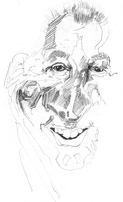
Caricature of Mark Rosen: Version one -
|
Briefly, what worked / didn't work in this picture
Plain and simple, this picture just doesn't look like Mr. Rosen to me. At all. The eyes are spaced a little too far, though I like the strong reflections in the eye and the dark contrast they display. The forehead shape is pretty good but the hair might be a little too long - making him appear younger than he is. Still I like the loose overall feel of the picture though - even though it looks like no one in particular :-). The mouth is just too symmetric - and too big to give the nose the dominance it needs. If I had finished with a long tapering neck, this may have worked better but I bailed on it before that. (I felt like I needed a better overall feel for the main shapes of the head and the more dominant features within it.) Below the sketch is the original photo.
|

First rough sketch

Minneapolis Media man Mark Rosen:
Sports caster extraordinaire
Kasbohm & Company's
Drawing-Faces-and-Caricatures-Made-Easy.com
and
YouCanDraw.com
© Copyright, All rights reserved 1997-2005