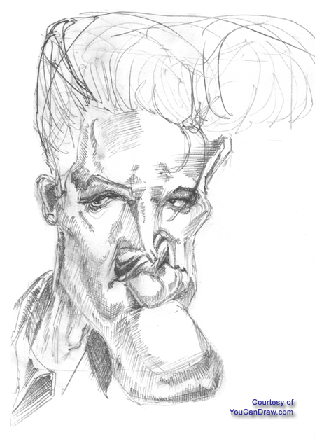
I really like the way this version of Elvis
turned out, but my timer was clicking down to the end of my drawing
session and I was just plain feeling lazy about filling in the hair. You
can get an idea of what I was heading for shape and volume wise with the
hair by the directionality of the lines in the hair. Now note this: even
if you draw sloppy, rough lines in the hair like I did here, you can
always erase them, or lighten them (by a little erasing) or just plain
cover them up under layers of pencil that would fill out the hair. In
fact, a loose outline of all sorts of lines under a more refined working
of the hair (like those fine and tedious - and time consuming - cross
hatch jobs I use in a lot of pictures) adds immensely to texture.
Watercolor painters use all sorts of layers
too: it makes for a much more interesting final product -- and
underscores the fact that misplaced lines, erasures, and even smudges only
add to the depth of a drawing. John Lovett is a watercolor painter; he doesn't
do caricatures but check out his site and see what I mean about layers and
texture: http://www.johnlovett.com/
Concerning shadows: Look at he lip, the
upper lids of the eyes, the side of the nose and even the chin and see if
you can't spot the cylindrical and almost spherical underlying primitive
shape -- and it's light / shadow pattern at work. (See the Flash Lesson on
Mouth and Lips too.)
Back
to January first 2005 newsletter
Kasbohm & Company's
YouCanDraw.com
© Copyright, All rights reserved 1997-2005
|