| Caricature and Drawing Newsletter for April, 2007
This newsletter is reproduced here courtesy of YouCanDraw.com -
Once and for all getting you drawing faces and caricatures:
April 2007
Back to the www.YouCanDraw.com Archives
||||||||||||||||||||||||||||||||||||||||||||||||||||||||||||||||||||||||||||||||||||||||||||||||||||||||||||||||||||||||||||||||||||||||||||||||||||||||||||||||||||||||||||||||||||||||
Your April 2007 YouCanDraw.com Communiqué
||||||||||||||||||||||||||||||||||||||||||||||||||||||||||||||||||||||||||||||||||||||||||||||||||||||||||||||||||||||||||||||||||||||||||||||||||||||||||||||||||||||||||||||||||||||||
Howdy all,
Hope you had a Happy Easter and Passover and that Tax day (in the states) isn't too, err, taxing. :-) And since you're all busy, I'll give you links that send you to any more in-depth areas of study and save all the long explanations. So today we'll just do a whip through of what makes Ramsey Clark (former U.S. Attorney General) caricaturable. But just for laughs...
First off is a recent pen and ink caricature of comedian of Don Rickles:
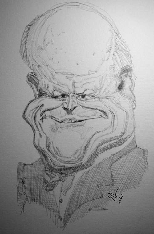
I actually did his caricature several weeks ago but my camera wasn't working - so I didn't get to photograph the progression while drawing, it. Today's victim, Mr. Clark shares the same page along side Mr. Rickles and you can see them both here:
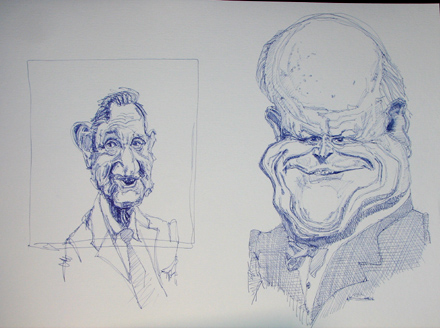
Get your pen or pencil and paper. Here we go. Great to have a reference photo or model to work from. Here's my screen with a group of Ramsey Clark photos and even one cartoon / editorial:
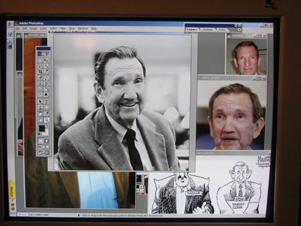
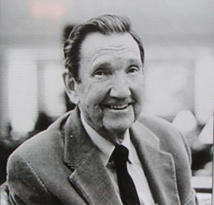
As you can tell he's a pretty drawable guy. Here's a close-up of the photo I decided to draw:
You can tell I always start off with a gang of pictures of the person I'm trying to draw. Well allow me to suggest getting a gang of pictures of anything you want to draw. It really helps. And if you're in a slump and can't get fired up, get yourself a library of Internet paintings, drawings, reproductions of any kind, web sites, what have you, and pour over other people's work. Something will grab you and you'll get all fired up again about drawing. Guaranteed!
Back to Mr. Clark. What do I note? What do I think is caricaturable? Here's a list:
- Lots of hair for a gentleman his age. Slightly old school. (Heck, if you live to be 70, 80, 90 years old and you still have hair, how can our headpiece not be old school? Just a thought.)
- Eyes are fairly wide set - and look pretty small, almost squinty in this photo. Eyes seem to slant up a little going from nose side of eyes to temple side of eyes;
- Bridge (or root) of nose is broad, doesn't indent in much as you traverse from forehead to the main body of the nose
- the nose is very triangular in shape;
- fleshy cheeks seem to bury the "apron of the upper lip" - contributes to rapid transition from bottom of nose to upper lip;
- upper lip is very thin, rolls right onto to upper set of teeth; Cupids Bow ("the cowlick" of the upper lip) comes to a subtle point;
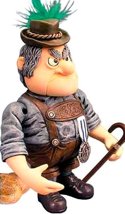
- the mouth and chin / jaw almost seem to be a separate piece of anatomy the way the Burgermeister Meisterburger puppet chin is a separate piece of mechanical anatomy;
- the overall shape of his head is very oval;
- Mr. Clarks head narrows to a thin neck on a working man's shirt, tie, and smoker.
That's it in a nutshell. Who's the Burgermeister Meisterburger? He's the guy who said
"All toys are hereby declared, Illegal, Immoral, and Unlawful!"
Here he is (see the chin?):
 |
theBurger-
meister
Meister-
burger
|
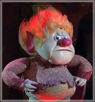
See RetroGalaxy.com for all sorts of stop-action puppets
I regress. Back to the task. Ok. Draw a format (Don't know what a format is? Do a search in your e-sourcebook. Ok, ok, it's a drawn border. The border you're going to draw a picture inside of. ) Here's the one I'm going to draw Mr. Clark in:
Next picture below: I began with the root (or bridge) of the nose. Tried to make it tall, triangular and appear to be in the same plane as the forehead. I've also begun on the eye (his left eye), drawn the body of the nose, the bulbous tip and the two nares. Nares are the two openings of the nose. You know, where you'll always find a two year olds fingers:
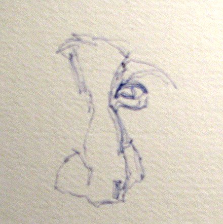
You can see also see the highlight shape on the tip of the nose there also (it's a rectangle). The style of drawing I'm using is the "pure contour" approach - see the two ezines posted before March. I've also drawn the groove above the upper eyelid and try to exaggerate the arch that he has.
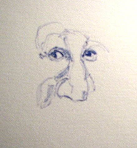
Next picture: Added the right eye. They (the eyes) got a little bigger than I wanted. But that's OK, I'm going to keep rolling. I also began by drawing contours of the cheeks. Making them fleshier and chubbier than they really are is accomplished by more lines and hatching to set up the 3d effect given by values and tones (values and tones refer to how dark the darks are getting and how white the lights are getting). Also, sorry if the pics are just a little blurry - the shutter and lens on my camera are new and I wasn't aware how unfocused the close-ups were getting. Also note how leaving just a little well placed highlight on the dark part of the eye (the iris) really makes it leap off the page):
Refer back to the original photo to get your bearings:

Got a lot drawn - or it at least seems like I got a lot drawn between the following picture and the one just above. But if you look close, it's really not a lot of lines. Find these - even on this small picture: the lines denoting the cheeks, the lips, the jaw, the forehead and hairline. Scroll up and down between the real photo just above and the drawing just below and discover the exaggerations. It DOES NOT matter what style of drawing you do, the basics of seeing DO NOT change.
Recognizing angles and proportion, seeing edges, visualizing negative shapes, comparing and contrasting angles and edges with true horizontal and vertical, perceiving light and dark of shadow and highlight: these DO NOT change. Accurate perception is at the root of all drawing - be it realistic or caricature regardless if your style is like Al Hirschman, David Levine or Phillip Burke. Develop your own style, but don't kid yourself. (Someone recently suggested was forcing my style on them. No, just wanted them to learn to see.)
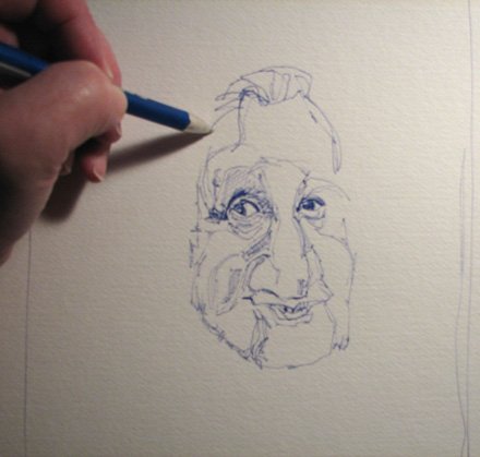
Ears! I forgot to mention ears above. Mr. Clark, like almost all white men of advanced age, has large ears. It's true, Caucasian men have the largest ears and the longest noses on the planet. And neither stops growing until they die. This is a fact.
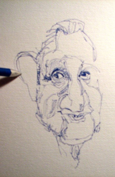
You can also see in the above photo the extra lines around the eyes. See the section on ears if you're feeling rusty on drawing ears. ( Or this "how to draw ears" page - no password necessary.) Also note the lines forming on the neck.
Refer frequently, even all the time to your subject, be they in a photo or live:

Adding the "Concha" to the ear. (Concha = the big seashell [conch] shape within the outer ear). Yep, the eyes really are too big and open. This picture confirms it. But that's ok. The likeness is still there, but could be made spot-on by nailing down those details.
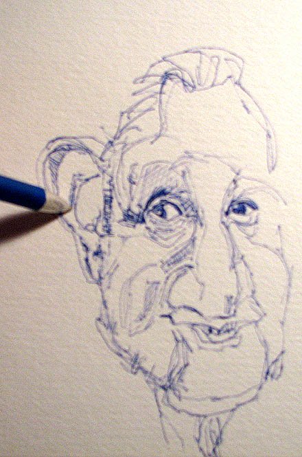
You can see in the picture below the ear is fairly well shaded in and I've begun darkening in the shadows in and around the mouth and teeth:
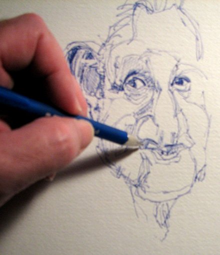
Close-up of the mouth. I think I got the shape of the upper lip down pretty good but it gets hid in all that ink. That's a risk of ink: you can't erase it very easily. Also note, since the "bottom of the nose line" and the "middle of the mouth line" are much closer than they are on Mr. Average, to caricature them, you draw them even closer. If you don't recall or understand these landmarks, see these sections in your book:
- http://ycdinsiders.digitalchainsaw.com/InsidersArtistLoft/ani_difranco_part_3.htm
- http://ycdinsiders.digitalchainsaw.com/InsidersArtistLoft/partv.htm
Refer to the MAN again:

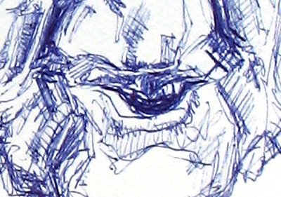
Ok, darkening the darks of the "palpebral fold" - the line above the upper eye lid, the hair line and the shadows around the mouth and chin:
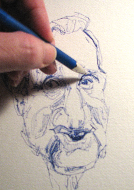
Ok! The extra hatches around and on the upper lids, the hair, the cheeks and the chin are making the depth, the 3d effect of this picture work very well. I'm happy :-) :
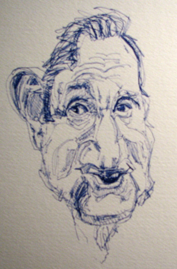
Squint your eyes and see if you can't collapse those areas of darkest shadows all condense into drawable shapes. Then try and draw them into the drawing. Do they match up with those same areas of our drawing - even if we're exaggerating?:

OK! Now we're in the last legs of this drawing. A rough treatment of the collar, the tie and the sport coat with minimal detail give the focus of the drawing something to stand on and lead your eye up into the drawing:
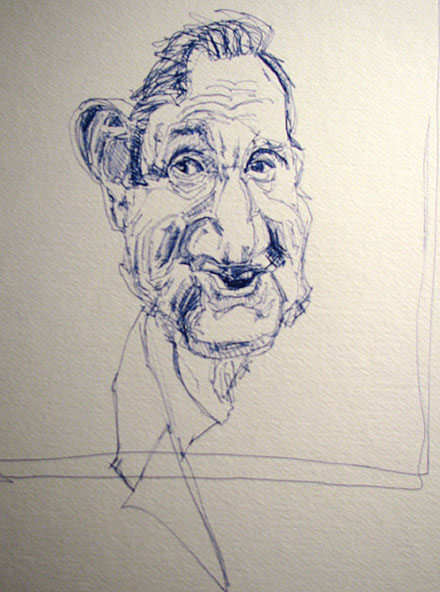
...and yes, I've gone way outside the drawn format. Do I care? I don't care! :-)
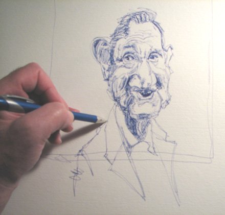
A little shading on that tie and a few more loose lines on the jacket and this drawing is done:
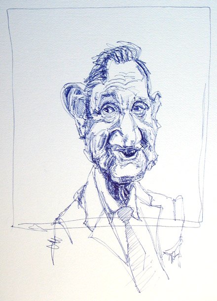
Does it work? It works ok. I think With a little more work around the mouth, teeth and lips, and with smaller and squintier eyes that turn up a little at the outside edges, more shadowing around the cheeks, this could be a really close likeness. (That's where getting up and getting some distance while you're drawing really helps. I don't do that when I do these zines...always racing to get them done :-) But I'm happy with it. Here's Mr. Clark smiling his approval (and for you to compare and come up with your own interpretation):

A little touchup in Photoshop (airbrushing) of the two drawings:
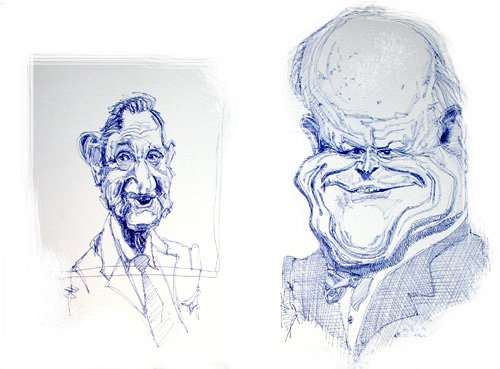

OK. Assignment: Compare every feature of the face you know of and ask yourself how are they different and how are they the same, for example:
- Who proportionately has the bigger nose, eyes, ears, chin, cheeks, neck, tie, collar, forehead,
- Where are the deepest shadows in either picture?
- Where are the brightest highlights?
- Is there anything similar about the highlights and shadows in the two drawings?
- Who's head is longer? Who's is wider?
- What part of the face is widest in each drawing?
- Can you visualize the a) middle of the eye line b) the bottom of the nose line c) the middle of the mouth line and d) can you strategize how you'd exaggerate even more?
Very cool! Now do 15 minutes of drawing. Get your timer. Draw one of the snap shot drawing above. Draw as much as you can in 15 minute. Use whatever paper or drawing pen / pencil you have right in front of you. 15 minutes, no excuses. Just do it :-) Now. Go.
Warmly,
Jeff
--------------------------------------------------------------------------------
Kasbohm & Company's
Drawing-Faces-and-Caricatures-Made-Easy.com
and
YouCanDraw.com
© Copyright, All rights reserved 1997-2007
|